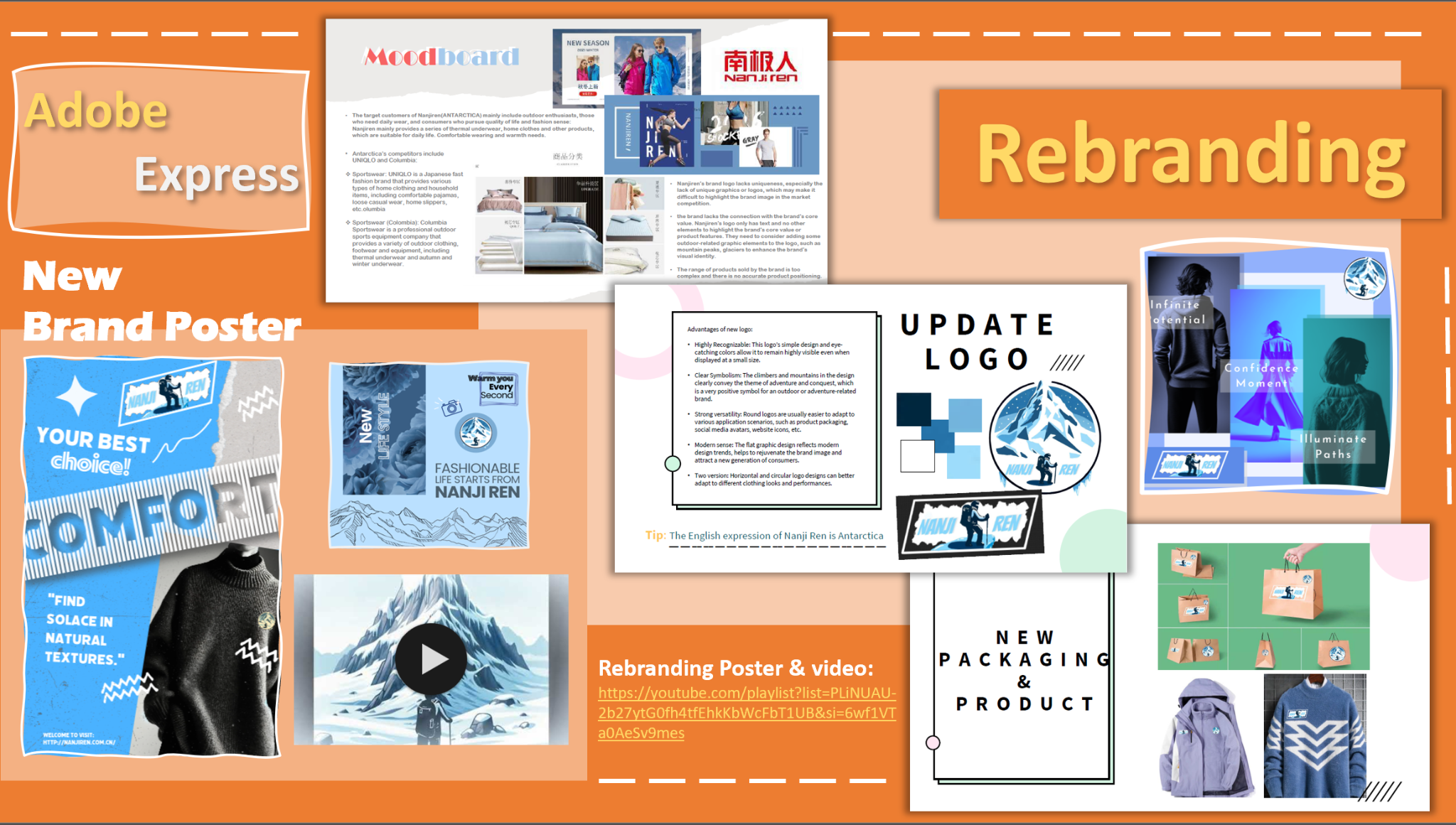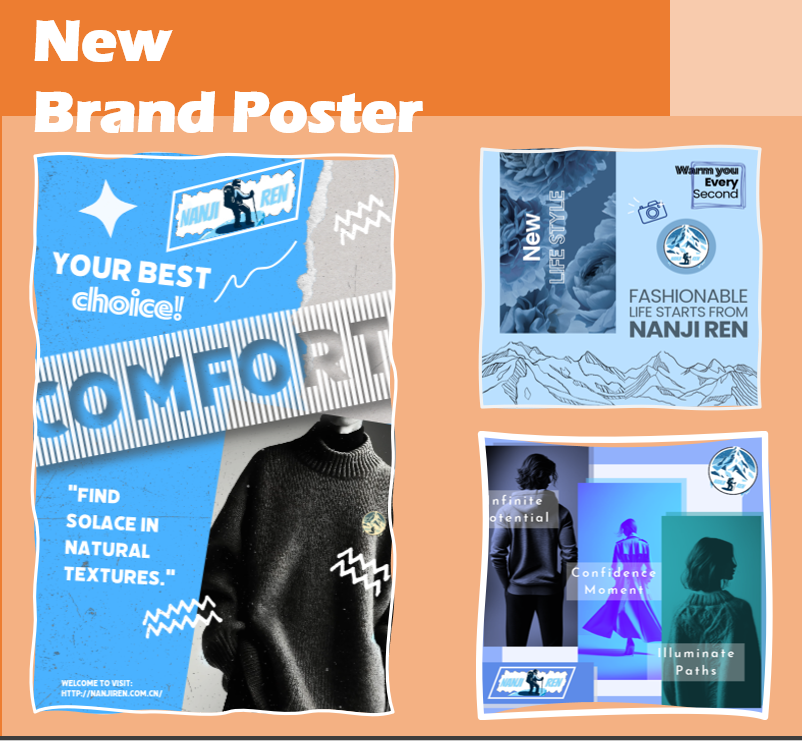

In this academic project, I redesigned the brand of Nanjiren in China. Nanjiren is a brand that mainly targets outdoor sports enthusiasts and consumers who pursue quality of life, providing products such as thermal underwear and home clothes. Through modern aesthetics and technology integration, I redefined the brand positioning, emphasizing the concept of "everyday luxury", while incorporating cultural elements to enhance the emotional resonance of the brand story. Finally, a new brand logo, packaging and visual identity system were designed to enhance the brand's market competitiveness and appeal.
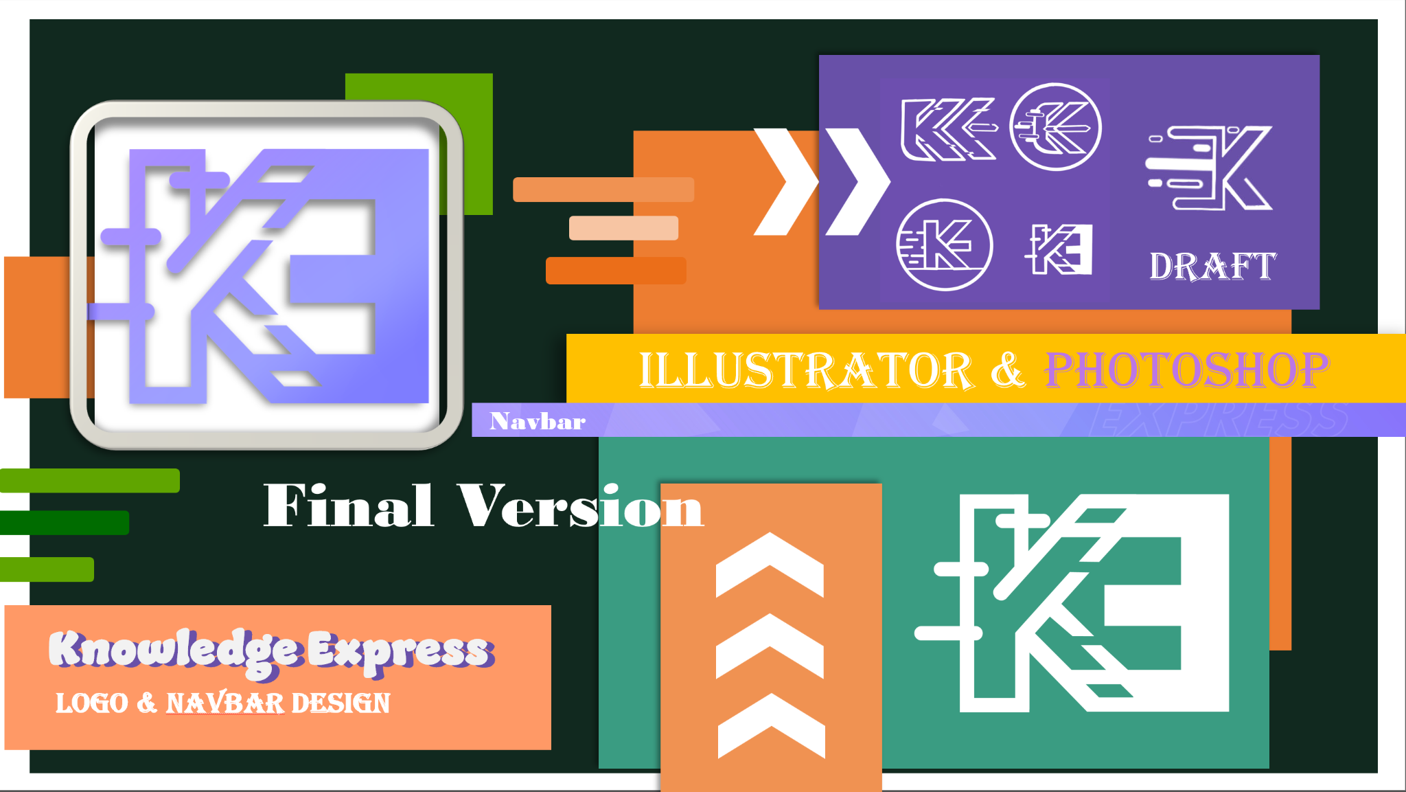
In this design assignment, I was invited to design a logo for KnowledgeShare's product "Knowledge Express", which is a product focused on providing AI-powered learning assistance. During the design process, I focused on the concept of speed to represent the rapidity and efficiency of AI-driven learning support. and the final output was created using Adobe Illustrator for precision and scalability.
I explored various draft versions, combining the letters "K" and "E" in different ways, and gradually refined them into the final logo design. The final logo incorporates elements such as dynamic lines and shapes, symbolizing the core concept of "speed". In addition, I also used visual themes such as arrows and streamlines to further emphasize movement and progress. The design maintains a simple and modern aesthetic, ensuring that the logo can effectively convey the brand's image across different media and platforms.
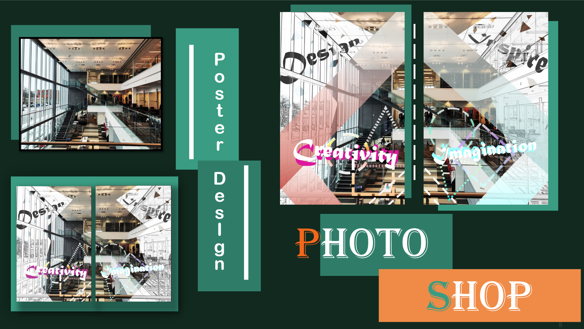
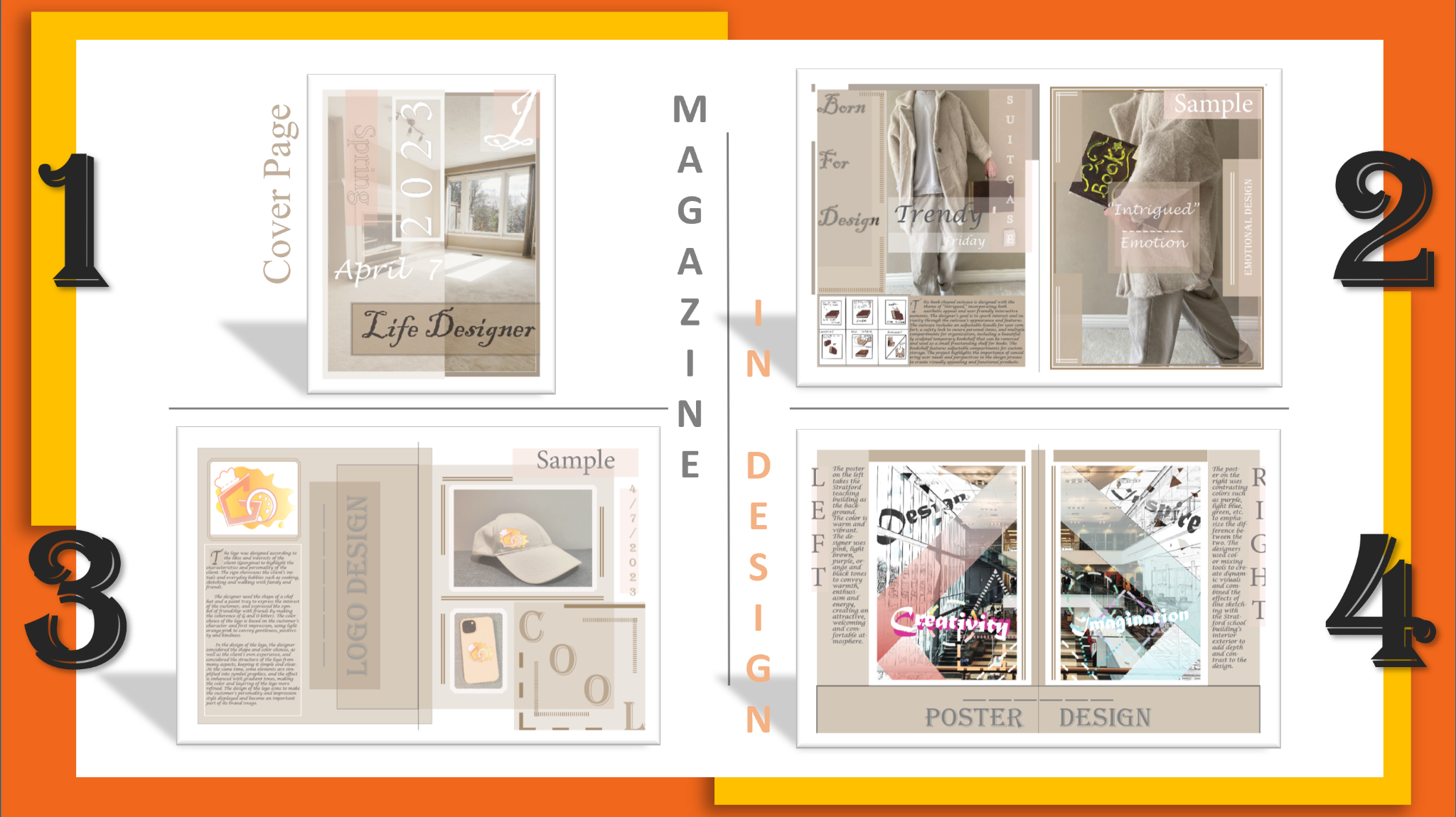
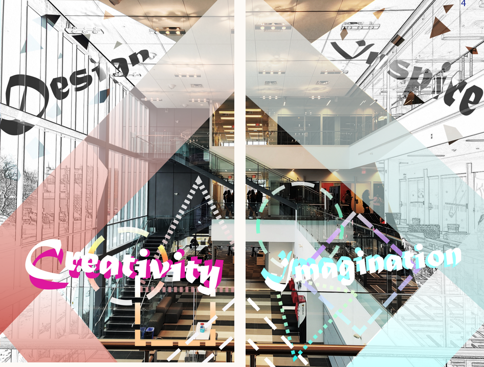
This poster shows a striking view of Stratford's academic buildings and was personally photographed during a classroom event. The design was inspired by the unique perspective and lines of architecture, especially the strong one-point perspective effect in the photo, which led me to decide to split the image into two parts to add visual interest. The poster was designed taking into account the uniqueness of the Stratford campus as a design school filled with multicultural students, and aimed to not only catch the viewer's eye but also convey the spirit and energy of the campus. The poster on the left uses warm colors, such as pink and orange, to create a welcoming and energetic feel, while the poster on the right uses cool colors, such as purple and light blue, to create a more dynamic effect through color mixing. The entire design process was an exploration of the diversity and creativity of the Stratford campus. The final poster was created in Adobe Photoshop, which allowed for detailed photo editing and color experimentation.
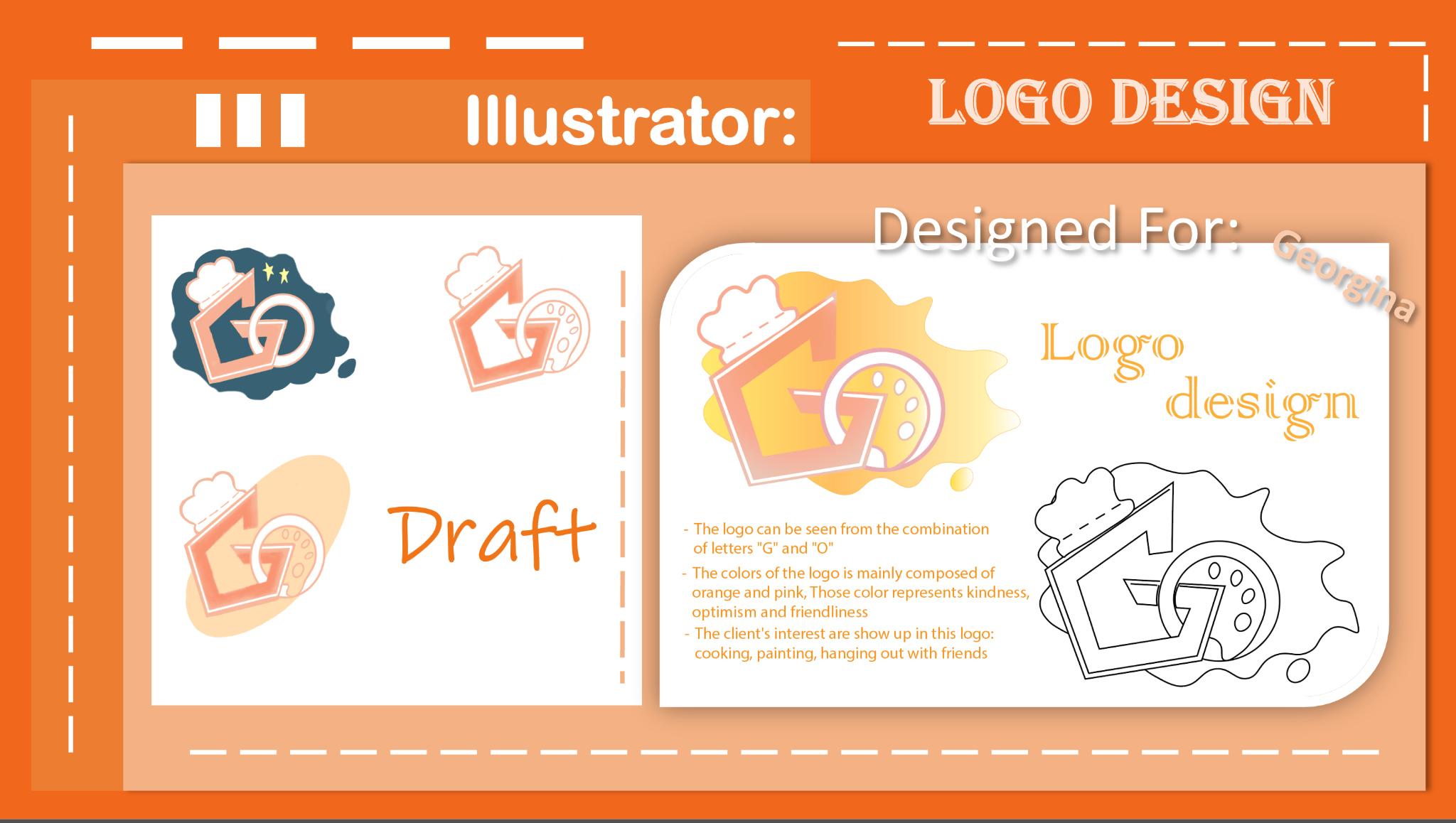
The logo was designed with the client's interests in mind, incorporating elements of cooking, painting and going out with friends, such as chef's hat and palette shapes, embodied in GEO's initials. The design takes shape, color and personality into consideration, and selects a warm light orange-pink color to symbolize the client's optimism and tenderness. By simplifying the elements into symbolic graphics, I created a logo that is both harmonious and simple, using gradient tones to add layers of sophistication. This process shows my design thinking and attention to detail.